A Shiny web interface for expert image comparison
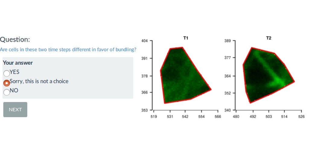
I participated to a scientific publication on the analysis of plant cell images with a bio-image data analyst Marion Louveaux. Part of the analysis was to define observation for each cell by visual expertise. The problem is that being able to observe the entire tissue when supposed to give an expertise for each cell biased the cell-centered expertise. I produce separated images of each cell out of the tissue. I mixed the images from different plant lines submitted to different treatments. I then proposed a R-shiny web interface to randomly show images to the experts and save their observations. This allowed for a non-biased expert image comparison, as the expert had no information on the origin of the cell shown.
A download-upload feature to save and continue analysis on shinyapps.io
The expert image comparison was long: 40min for the small analysis and 3h for the complete one. As the shinyapp is freely hosted on the Rstudio shinyapps.io servers, it was not possible to save outputs of a specific session on the server. Thus, the web application has been built such that the experts can download a zip file of their partial expertise and come back later. They were then able to upload the beginning of their expertise and continue their analysis when they wanted. The download/upload feature was a good alternative to the limit of the free hosting service.
You can try this Shinyapp here : https://statnmap.shinyapps.io/Visual_Expert/ * Code is available on Github: https://github.com/statnmap/RShiny-VisualExpertPublic
You can participate !
The R-shiny interface is made such that you can provide your own expertise and retrieve your results. If you want to test your eye against the eye of the co-authors, it is possible ! Data presented in the web interface are the exact image dataset of the publication. If you provide a complete analysis and send us your results, we may include them in the figures of the R-shiny web interface. The complete analysis may require ~3h, but the special case may only require ~40min.
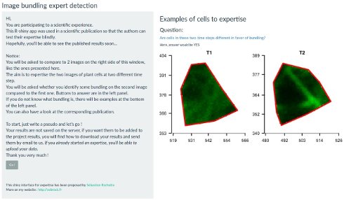
Figure 1: Snapshot of the expert image comparison shinyapp
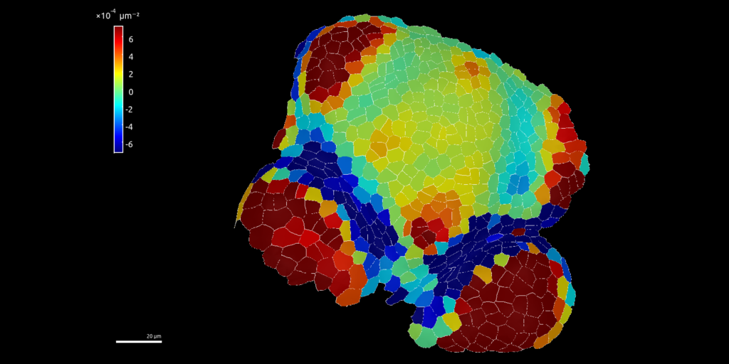
Quantitative cell micromechanics in Arabidopsis
… or “How to use geostatistical indices to compare image fluorescence of plant cells? …”
Citation
Louveaux, M., Rochette, S., Beauzamy, L., Boudaoud, A. and Hamant, O. (2016), The impact of mechanical compression on cortical microtubules in Arabidopsis: a quantitative pipeline. Plant J. Volume88, Issue2. 328-342. doi:10.1111/tpj.13290
Summary
Exogenous mechanical perturbations on living tissues are commonly used to investigate whether cell effectors can respond to mechanical cues. However, in most of these experiments, the applied mechanical stress and/or the biological response are described only qualitatively. We developed a quantitative pipeline based on microindentation and image analysis to investigate the impact of a controlled and prolonged compression on microtubule behaviour in the Arabidopsis shoot apical meristem, using microtubule fluorescent marker lines. We found that a compressive stress, in the order of magnitude of turgor pressure, induced apparent microtubule bundling. Importantly, that response could be reversed several hours after the release of compression. Next, we tested the contribution of microtubule severing to compression-induced bundling: microtubule bundling seemed less pronounced in the katanin mutant, in which microtubule severing is dramatically reduced. Conversely, some microtubule bundles could still be observed 16 hours after the release of compression in the spiral2 mutant_,_ in which severing rate is instead increased. To quantify the impact of mechanical stress on anisotropy and orientation of microtubule arrays, we used the nematic tensor based FibrilTool ImageJ/Fiji plugin. To assess the degree of apparent bundling of the network, we developed several methods, some of which were borrowed from geostatistics. The final microtubule bundling response could notably be related to tissue growth velocity that was recorded by the indenter during compression. Because both input and output are quantified, this pipeline is an initial step towards correlating more precisely the cytoskeleton response to mechanical stress in living tissues.
3D representation of cell fluorescence with R
The following image is from a plant cell png image of fluorescence as observed using confocal microscope and converted to a Spatial raster object in R.
Polygons are Spatial Polygons of cell delineation.
Coordinate reference system is in meter for the purpose of the study but does not mean anything…
Fluorescence has been used has a Digital Elevation Model (DEM) to be represented in 3D.
Fluorescence colored raster has been draped over the MNT in 3D using library rgl in R.
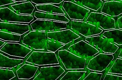
Figure 2: Cell fluorescence converted into a 3D landscape
# R code to drape raster in 3D (like Figure 2)

library(rgl)
# Get green layer of the rgb image of a meristem under fluorescence
r3D <- raster("image.png", layer = 2)

# Palette from black to green in 256 colors
myPal <- colorRampPalette(c("black","green"))
# Attribute green level to each pixel of the raster
n.color <- 256
color <- rev(myPal(n.color))[(n.color + 1) - c((values(r3D)-min(values(r3D),na.rm=TRUE))/(max(values(r3D),na.rm=TRUE)-min(values(r3D),na.rm=TRUE))) * n.color]

# Transform raster as a matrix to be included in the plot3d
datamat <- matrix(values(r3D),nrow=dim(r3D)[2],ncol=dim(r3D)[1])[,c(dim(r3D)[1]:1)]
# Transform color vector as a matrix to drape raster colors in the 3d plot
colormat <- matrix(color,nrow=dim(r3D)[2],ncol=dim(r3D)[1])[,c(dim(r3D)[1]:1)]

# SpatialPolygons representing cells limits : SpP
# Transform polygons as SpatialLines to draw on the 3d plot
SpP.Lines <- as(SpP, "SpatialLines")

# Figure
open3d()
rgl.bg(col="black")
# Add the raster with its color drape
# Prefer this function instead of drape function from library rasterVis
persp3d(datamat
  ,x = seq(xmin(r3D), xmax(r3D)-xres(r3D), xres(r3D)), y = seq(ymin(r3D), ymax(r3D)-yres(r3D), yres(r3D))
  ,col=colormat , shininess = 128, specular = "grey10")

# axes3d()
# Change 3d aspect ratio
aspect3d(1,1,0.06)

# Add the lines corresponding to the polygons
# z corresponds to the z-coordinate where to draw the lines
# Loop on different values of z allows to draw a certain line width
# as lwd with lines3d does not really work...
# Because lwd
for (z in 150:160) {
  lapply(1:77, function(i) lines3d(cbind(coordinates(SpP.Lines)[[i]][[1]], z), col ="white", add = TRUE))
}

# Save the snapshot of the image
rgl.snapshot( "3D_cell_green_fluorescence.png", fmt="png", top=TRUE )
Have a look at Marion’s website or her github repository, she’s playing with 3d image analyses with R:
Citation:
For attribution, please cite this work as:
Rochette Sébastien. (2016, Aug. 02). "Rshiny expert image comparison app". Retrieved from https://statnmap.com/2016-08-02-rshiny-expert-image-comparison-app/.
BibTex citation:
@misc{Roche2016Rshin,
    author = {Rochette Sébastien},
    title = {Rshiny expert image comparison app},
    url = {https://statnmap.com/2016-08-02-rshiny-expert-image-comparison-app/},
    year = {2016}
  }