Correlation between rasters
In this blog article, I propose a way to look at the spatial repartition of correlation between two rasters. For your own reason, you may want to know the correlation between rasters, but a unique value issued from fonction cor is not enough. You would like to know if there are variations of correlation in space. You can not compare raster cell by cell, so let’s use a little trick.
Some drawing utilities
To draw a raster using {ggplot2}, I recently modified fonction gplot from library {rasterVis} so that we can retrieve extracted raster values as a tibble, instead of directly plotting. Among different things, this allows to remove tiles without values (value = NA), which makes the raster lighter to plot. This function is called gplot_data in my {SDMSelect package on github}. I present it a little in this blog section.
We will add polygons of European countries. I found part of the list on Ewen Gallic website, which saved me, as I am not sure I would have had the entire list…
# Libraries
library(raster)
library(dplyr)
library(mapview)
library(mapedit)
library(sf)
library(readr)
library(ggplot2)
Comparison between water Temperature and Chlorophyll-a
For the example, we use raster layers of (1) average spring bottom temperature of 2010-2014, extracted from the hydrodynamic model MARS3D (Ifremer, Cailleaux et al., 2016. Data from 500m model.) and (2) average spring surface chlorophyll concentration of 2003-2010, extracted from MODIS satellite (Ifremer, Gohin, F., Druon, J. N., and Lampert, L.: A five channel chlorophyll concentration algorithm applied to SeaWiFS data processed by Seadas in coastal waters, (2002). International Journal of Remote Sensing, 23, 1639-1661.
Sorry the data is not directly available for a reproducible example, but if you really want these specific data, you can ask the authors above.
temp_r <- raster(file.path(extraWD, "PREVIMER_F1-MARS3D-MANGAE2500_2010-2014_spring_TEMP_mean.tif"))

chl_r <- raster(file.path(extraWD, "chlorophyll_a_2003-2010_spring_mean.tif"))


# Geographic Western Europe
Europe <- c(
  "Austria", "Belgium", "Bulgaria", "Croatia", "Cyprus",
  "Czech Rep.", "Denmark", "Estonia", "Finland", "France",
  "Germany", "Greece", "Hungary", "Ireland", "Italy", "Latvia",
  "Lithuania", "Luxembourg", "Malta", "Netherlands", "Poland",
  "Portugal", "Romania", "Slovakia", "Slovenia", "Spain",
  "Sweden", "UK",
  "Switzerland", "Norway", "Monaco", "Jersey", "Guernsey",
  "Azores")

Europe_border <- map_data("world") %>%
  filter(region %in% Europe)

# This extract part of the data for lighter plots (like rasterVis)
temp_dat <- SDMSelect::gplot_data(temp_r, maxpixels = 50000) %>%
  mutate(variable = "Temperature") %>%
  filter(!is.na(value))
chl_r_dat <- SDMSelect::gplot_data(chl_r, maxpixels = 50000) %>%
  mutate(variable = "Chlorophyll-a") %>%
  filter(!is.na(value))

# Plot
g1 <- ggplot(temp_dat) +
  geom_tile(aes(x, y, fill = value)) +
  scale_fill_gradient2("T°C",
    low = scales::muted("blue"),
    high = scales::muted("red"),
    midpoint = mean(temp_dat$value)) +
  geom_polygon(data = Europe_border,
               aes(long, lat, group = group),
               fill = "white",
               colour = "grey20", size = 0.1) +
  coord_quickmap(
    xlim = range(temp_dat$x),
    ylim = range(temp_dat$y)
  ) + xlab("") + ylab("")

g2 <- ggplot(chl_r_dat) +
  geom_tile(aes(x, y, fill = value)) +
  scale_fill_gradient("Chl-a", low = "white",
                      high = "forestgreen",
                      trans = "log") +
    geom_polygon(data = Europe_border,
               aes(long, lat, group = group),
               fill = "white",
               colour = "grey20", size = 0.1) +
  coord_quickmap(
    xlim = range(chl_r_dat$x),
    ylim = range(chl_r_dat$y)
  ) + xlab("") + ylab("")

gridExtra::grid.arrange(g1, g2, ncol = 2)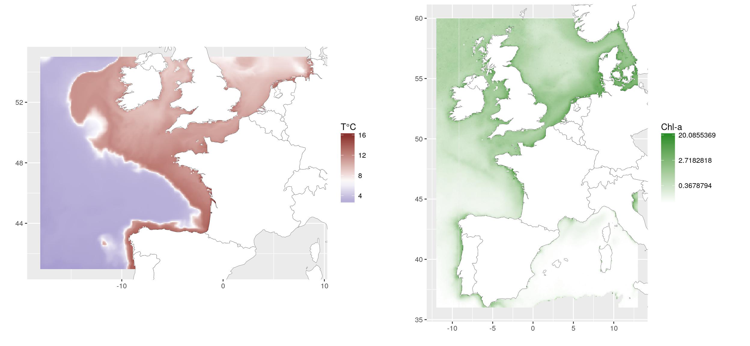
Aggregate, crop and resample rasters to allow comparison
Because I like {mapview} and {mapedit}, I use them to define a smaller extent to work on. I already played with these spatial libraries on a blog post for ThinkR.
ext_pol <- mapview(temp_r) %>%
  editMap()

extent_pol <- ext_pol$finished
write_rds(extent_pol, file.path(extraWD, "extent_pol.rds"))We can now crop the temperature raster using the defined extent. I also aggregate (x2) it to have fewer data and accelerate following calculations. As the extent polygon as been created as a {sf} object, we need to convert it to {sp} object to work with library {raster} functions. The chlorophyll raster is also aggregated. I used a x4 aggregation so that its resolution is closer to the one of the temperature raster. This may be important considering the way resample function is working, but I will not go into deeper explanations. Then I can resample the chlorophyll raster so that it is totally comparable to the temperature one.
temp_crop_r <- raster::crop(temp_r, as_Spatial(st_geometry(extent_pol))) %>%
  aggregate(2)

chl_res_r <- aggregate(chl_r, 4) %>%
  resample(temp_crop_r)

# Stack covariates
temp_chl_s <- stack(temp_crop_r, chl_res_r)
names(temp_chl_s) <- c("temperature", "chlorophyll-a")

# Old way to plot...
plot(temp_chl_s)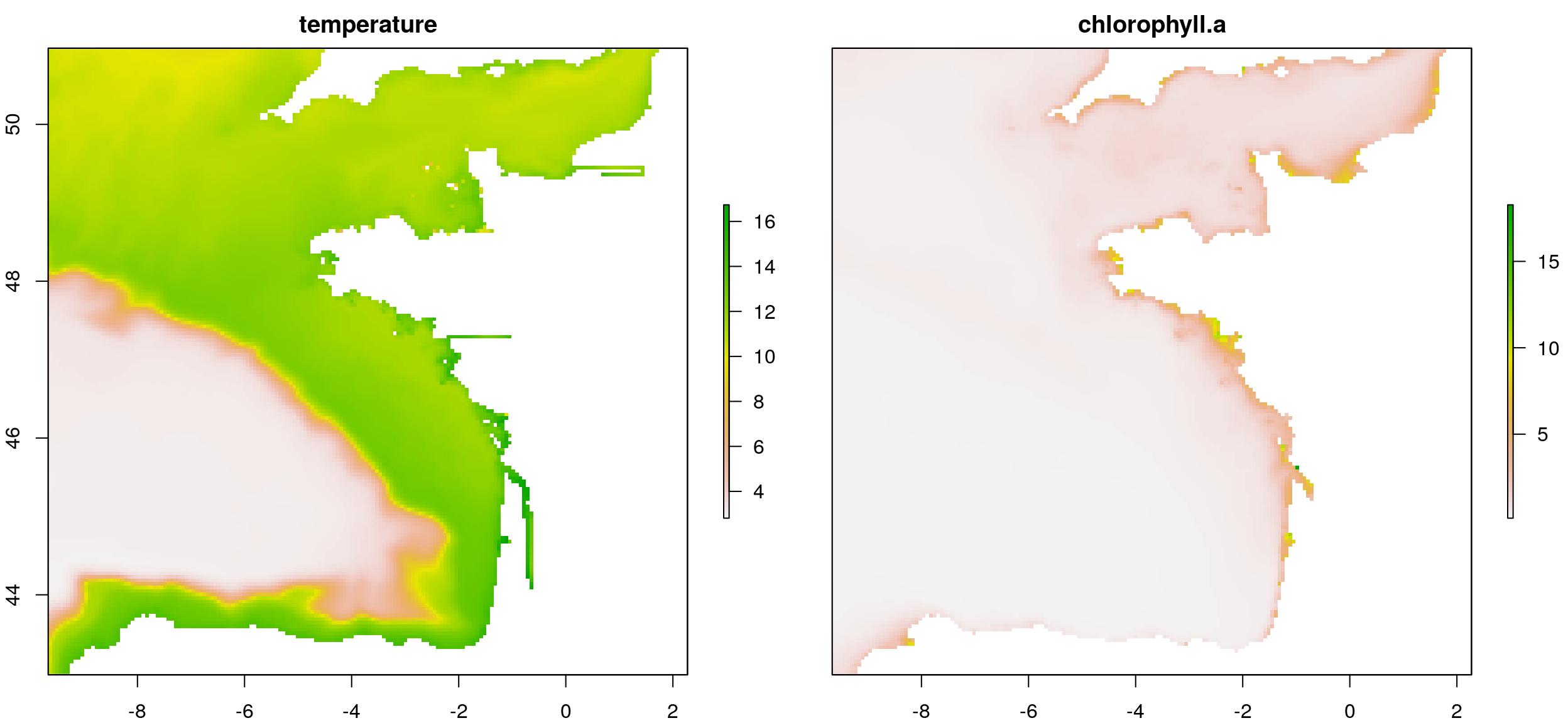
Calculate overall correlation
The overall correlation is a usual operation using function cor between values of the two rasters. This returns a single value.
# Correlation between layers
cor(values(temp_chl_s)[,1],
    values(temp_chl_s)[,2],
    use = "na.or.complete")
## [1] 0.3945855Estimate a linear model
Another way to see if there is correlation between both layers is to define a linear model (here lm(chl-a ~ T°C)). To have a look at the spatial heterogeneity, we can plot the distribution of residuals of the model. (Do not forget to retrieve missing residuals from NA values.). This map shows where observations deviates from the model. We could say that chlorophyll-a is underestimated along the coasts when using temperature as a linear predictor.
lm1 <- lm(values(temp_chl_s)[,2] ~ values(temp_chl_s)[,1])
summary(lm1)
##
## Call:
## lm(formula = values(temp_chl_s)[, 2] ~ values(temp_chl_s)[, 1])
##
## Residuals:
## Min 1Q Median 3Q Max
## -0.7938 -0.4277 -0.0068 0.0679 10.6740
##
## Coefficients:
## Estimate Std. Error t value Pr(>|t|)
## (Intercept) -0.128173 0.013327 -9.617 <2e-16 ***
## values(temp_chl_s)[, 1] 0.084055 0.001383 60.794 <2e-16 ***
## ---
## Signif. codes: 0 '***' 0.001 '**' 0.01 '*' 0.05 '.' 0.1 ' ' 1
##
## Residual standard error: 0.7664 on 20042 degrees of freedom
## (11462 observations deleted due to missingness)
## Multiple R-squared: 0.1557, Adjusted R-squared: 0.1557
## F-statistic: 3696 on 1 and 20042 DF, p-value: < 2.2e-16# Retrieve residuals considering missing values
resid_lm <- raster(temp_chl_s, 1) * NA
values(resid_lm)[-lm1$na.action] <- lm1$residuals
# Figure
resid_lm_dat <- SDMSelect::gplot_data(
resid_lm, maxpixels = 50000) %>%
mutate(variable = "Residuals") %>%
filter(!is.na(value))
ggplot(resid_lm_dat) +
geom_tile(aes(x, y, fill = value)) +
scale_fill_gradient2("Residuals",
low = scales::muted("red"),
high = scales::muted("blue"),
midpoint = 0) +
geom_polygon(data = Europe_border,
aes(long, lat, group = group),
fill = "white",
colour = "grey20", size = 0.1) +
coord_quickmap(
xlim = range(resid_lm_dat$x),
ylim = range(resid_lm_dat$y)
) + xlab("") + ylab("")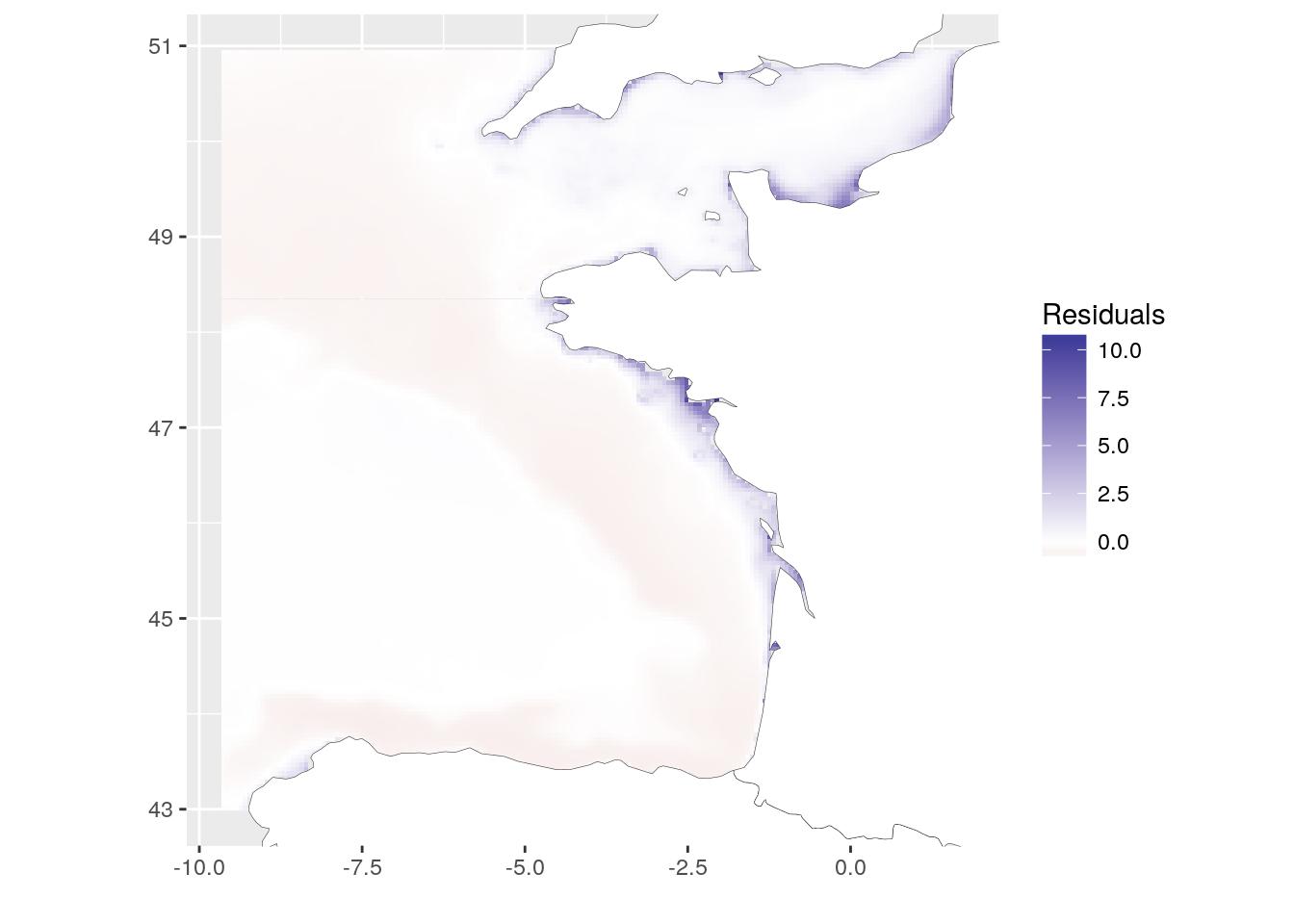
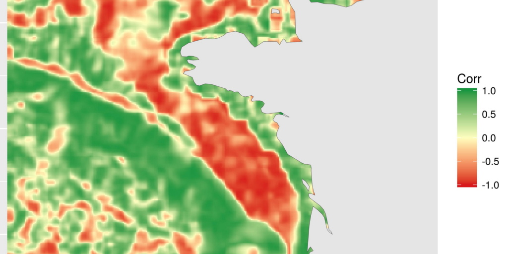
Calculate local correlation using focal on two rasters at the same time
The local correlation is a different way to see the relation between two covariates in space. The idea a simple. Around each cell of the rasters, we define a focal area (square, round, …). For the example, I chose a 5*5 square. We calculate the correlation between the 25 values of each raster in this square using function cor. This local correlation is recorded for the central cell. This operation is repeated over the entire raster thanks to focal function of library {raster}.
However, we need to use a trick to use the function on two rasters at the same time. We define a third raster (temp_chl_s_nb) that records the positions of values from 1 to ncell. focal will thus extract the positions for which we can get values of the two rasters (as they now have the same extent, origin and resolution).
[EDIT 2019-09-07] Thanks to a comment from Matthias Weigand, we can speed up the procedure by passing the stack as matrix in the focal function. See the lines with comments [MW] below. Be careful if you manipulate big rasters, this may use some more RAM.
temp_chl_s_nb <- raster(temp_chl_s, 1)
values(temp_chl_s_nb) <- 1:ncell(temp_chl_s)

matrix_chl_s <- values(temp_chl_s) # stack as raster [MW]

focal_cor <- focal(
  x = temp_chl_s_nb,
  w = matrix(1, 5, 5),
  # fun = function(x, y = temp_chl_s){ # Original
    # cor(values(y)[x, 1], values(y)[x, 2], # Original
        # use = "na.or.complete")
  # },
  fun = function(x, y = matrix_chl_s){ # [MW]
    cor(y[x, 1], y[x, 2], # [MW]
        use = "na.or.complete")
  },
  filename = file.path(extraWD, "focal_cor.tif"),
  overwrite = TRUE
)
The resulting map shows areas where correlation between chlorophyll-a and temperature is negative, null or positive. This is a different way to see relation between covariates. Here, for instance, we can see the positive relation along the coasts and the negative relation on the plateau. I will not go into deeper scientific considerations here. This is not the aim of this blog article. I may also remember you that covariates are bottom temperature, as modelled by a 3D hydrodynamical model and surface chlorophyll-a, as computed from satellite data. The general comparison has probably little scientific interest, but these are the most accessible covariates (with a different extent) that I had with me today…
focal_cor <- raster(file.path(extraWD, "focal_cor.tif"))
# Get data for ggplot
focal_cor_dat <- SDMSelect::gplot_data(focal_cor, maxpixels = 50000) %>%
  mutate(variable = "Correlation") %>%
  filter(!is.na(value))

# Plot
ggplot(focal_cor_dat) +
  geom_tile(aes(x, y, fill = value)) +
  scale_fill_gradient2("Corr",
    low = "#d7191c",
    mid = "#ffffbf",
    high = "#1a9641",
    midpoint = 0) +
  geom_polygon(data = Europe_border,
               aes(long, lat, group = group),
               fill = "white",
               colour = "grey20", size = 0.1) +
  coord_quickmap(
    xlim = range(focal_cor_dat$x),
    ylim = range(focal_cor_dat$y)
  ) + xlab("") + ylab("")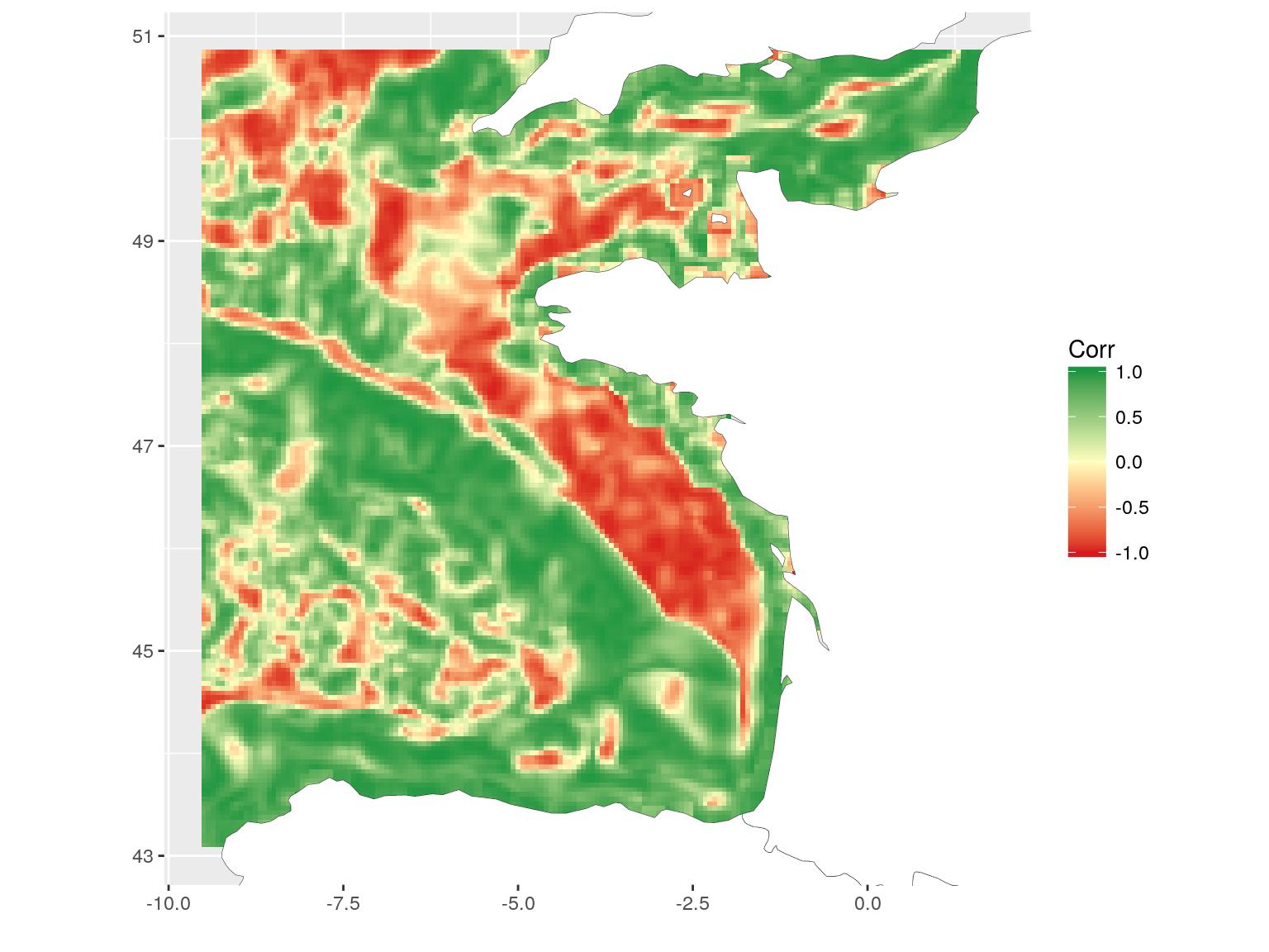
Recently, I used this local correlation fonction for a project with Marion (Marion Louveaux, bio-image analyst) and it had nothing to do with geographic data. The aim was to examine the concentration of chemical components in a plant root over time. The data was stored in a matrix with the position in the root in rows and the time in columns. The local time-position correlation allows to observe the evolution of the components in the root.
If you open your mind, you’ll see that this marvellous {raster} library can be used for other things than geographical data…
The R-script of this article is available on my Blog tips github repository
I like this one. Very good use of deep learning: Translated with the help of <www.DeepL.com/Translator>
Citation:
For attribution, please cite this work as:
Rochette Sébastien. (2018, Jan. 27). "Spatial correlation between rasters". Retrieved from https://statnmap.com/2018-01-27-spatial-correlation-between-rasters/.
BibTex citation:
@misc{Roche2018Spati,
    author = {Rochette Sébastien},
    title = {Spatial correlation between rasters},
    url = {https://statnmap.com/2018-01-27-spatial-correlation-between-rasters/},
    year = {2018}
  }